New design for CMU's homepage to use 'lean and clean' approach

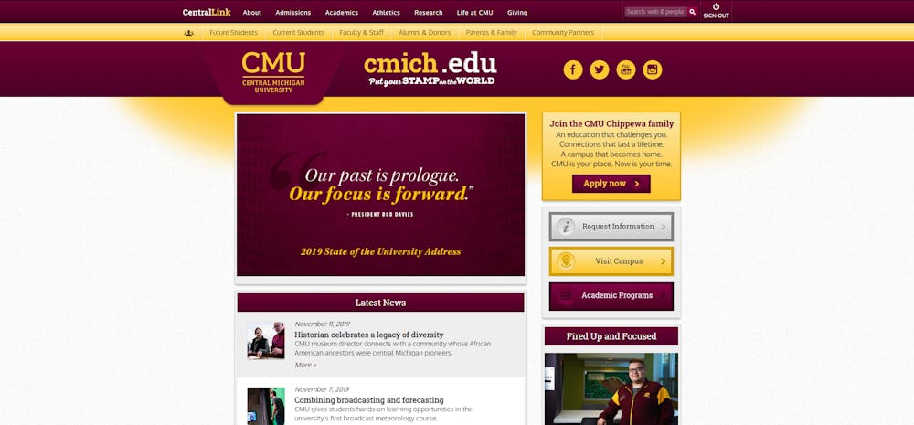
The homepage of Central Michigan University's website Nov. 12. The earliest versions of this design date to 2013.
A new “lean and clean” look for Central Michigan University’s website is in the works. Those involved believe the new site will be live before the 2021 spring semester.
The updated design is being developed with the help of mStoner, a Chicago creative agency that developed University of North Dakota and Lipscomb University’s current websites.
A core team of four staff from University Communications and the Office of Information Technology (OIT) is overseeing its daily progress, and a group of eight executive sponsors including high-level administrators like President Bob Davies is guiding the big decision-making.
The site’s current design dates from 2013. Discussions about redesigning the website began two or three years ago, Roger Rehm, executive sponsor and vice president for information technology said. It “really accelerated” when Davies began serving as president in September 2018.
In the face of plunging enrollment, the development of CMU’s new website will be steered toward one goal: recruitment.
It’s more than a fresh coat of paint. It’s an overhaul that will merge three websites (cmich.edu, go.cmich.edu and global.cmich.edu) into one destination with a focus on getting you the information you’re looking for as efficiently as possible.
The approach is enshrined in the project’s motto: “lean and clean.”
To core team member Abby Dean, director of integrated marketing for University Communications, “lean and clean” means making information compact and “easily digestible.”
“There are some websites where you’re just a little overwhelmed when it fully loads because there’s just so much going on,” Dean said. “We want to make sure that we give the users as good of a chance as we can to really digest that content.”
Visitors to CMU’s current website are bombarded with a row of drop-down menus at the top containing nearly 40 links, resting above another row of menus with over 50 more links. There isn’t even just one website, either, there are two more – one for Global Campus and another for recruitment – which were “born of necessity” along the line, Dean said.
“It’s grown over time in so many ways,” said Darcie Wilson, associate director of OIT’s project management office and a member of the core team. “I feel like it’s why we also need some clean-up.”
The project is in a discovery phase, with only very preliminary "wireframe" designs being drawn up, but work on a "strategy" phase is being done simultaneously to speed up the progress, Dean said. The team is working with mStoner to devise a more coherent way to organize the website’s information and resources, formally known as the site’s “information architecture,” to avoid frustrating or scaring away potential students.
To do this, mStoner is conducting “experience mapping” sessions with a mix of on-campus, off-campus, online and transfer students.
During an experience mapping session, mStoner asks a student to perform a task, such as finding a particular piece of information on the website, and analyzes what they do – where they look and whether it’s there – for indications of how the task can be made easier.
mStoner’s findings from the experience mapping sessions will be presented to the project’s executive sponsors on Nov. 14 and 15.
The campus community can follow the project's progress on its blog.
“The blog is intended to be sort of that hub for information and a vehicle where we can communicate to campus and make sure that there’s transparency throughout the entire process,” Dean said.


